I was fortunate enough to be amongst a small group of designers that got early access to Uizard‘s Alpha release of their AI tool called Autodesigner. In short, it’s ChatGPT for UI design that is able to generate entire UI designs and prototypes in seconds from a single text prompt, and it is pretty impressive.
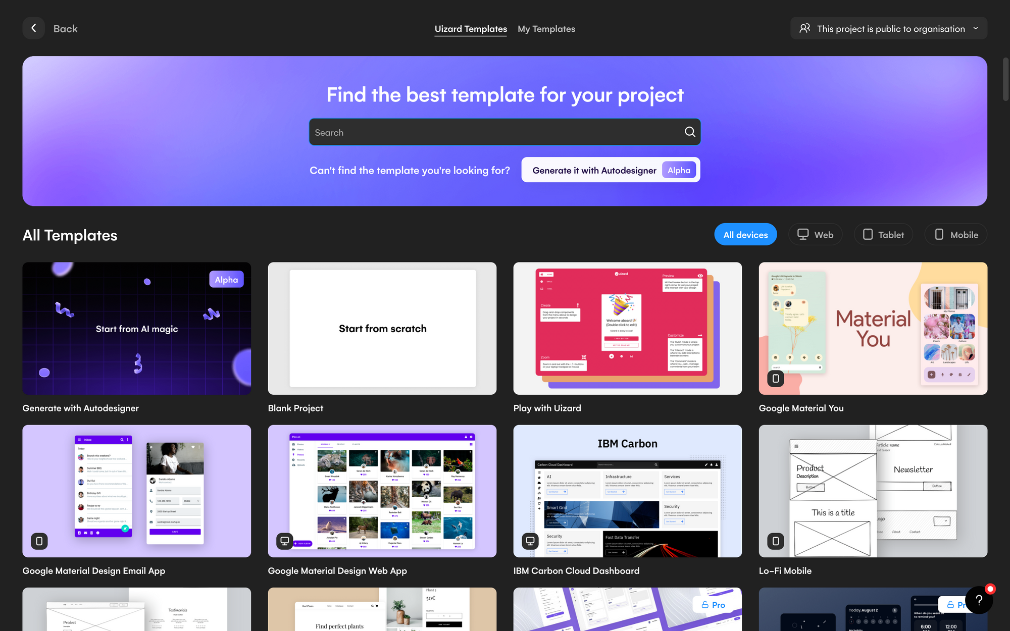
Just a few minutes into the demo and I was mesmerized.
Conflicting feelings of terror and excitement washed over me as I watched Uizard’s Autodesigner AI turn boring text prompts into high-fidelity UI screens, flows and working prototypes right before my eyes. The next day, I got access to it myself and things got interesting. Here is my first look at Uizard’s Autodesigner and what it can do.
Introducing Uizard’s Autodesigner Interface
Here we are inside of Autodesigner. At first glance, it’s a rather unassuming and simple interface.
You can choose between a mobile, tablet, or web design and then, simply type in your text prompt the same way you would in ChatGPT, for example. Then you can add some descriptive keywords to explain the style you want, and select from a few predetermined tags. You can also use a pre-generated example, I decided to try this first. The generated prompt says “food delivery app for developers who hate to leave the house.” That sounds pretty accurate to me. The style it described is “cyber” and “techy.” I then clicked “generate my project”.
It took less than a minute and on the other side awaited some surprising results.
Uizard Interface
If you’ve never been inside of Uizard before, it’s very similar to other UI design software that you might be familiar with, like Figma or Sketch. There are controls for design parameters, shapes, and basic elements in the left sidebar, as well as different components that were also generated based on this concept. On the right, is a context menu modal that pops out depending on the elements you are interacting with.
Generated UI Screens
Cleverly named DevDelight, the AI-generated 5 screens for me and surprisingly they’re not that bad. Not only has it created the screen designs, but it’s done so in a logical flow with screens consisting of the following:
Home — item images, tags, shopping cart icons, price, AI-generated placeholder text, and a nice menu down.
Search — search area, with option to search by tags or price range.
Search Results — item list with price and description (there were some issues with the text alignment rendering here that needed to be manually adjusted).
Product Details — breadcrumb menu, item image with details, price, add-to-cart interaction, ratings and tags.
Cart Order Status — a timeline of how your order is progressing
Editable Elements
The best part about is that everything that is generated is fully editable! I can click on any element and change the text, I can change the images and with Unsplash conveniently integrated, I can find the stock images that I need very quickly. Just like you would inside of Figma or Sketch, every element can be moved, changed or deleted. This really allows for seamless integration of the AI-generated design with your own creative vision.
Adding New Components
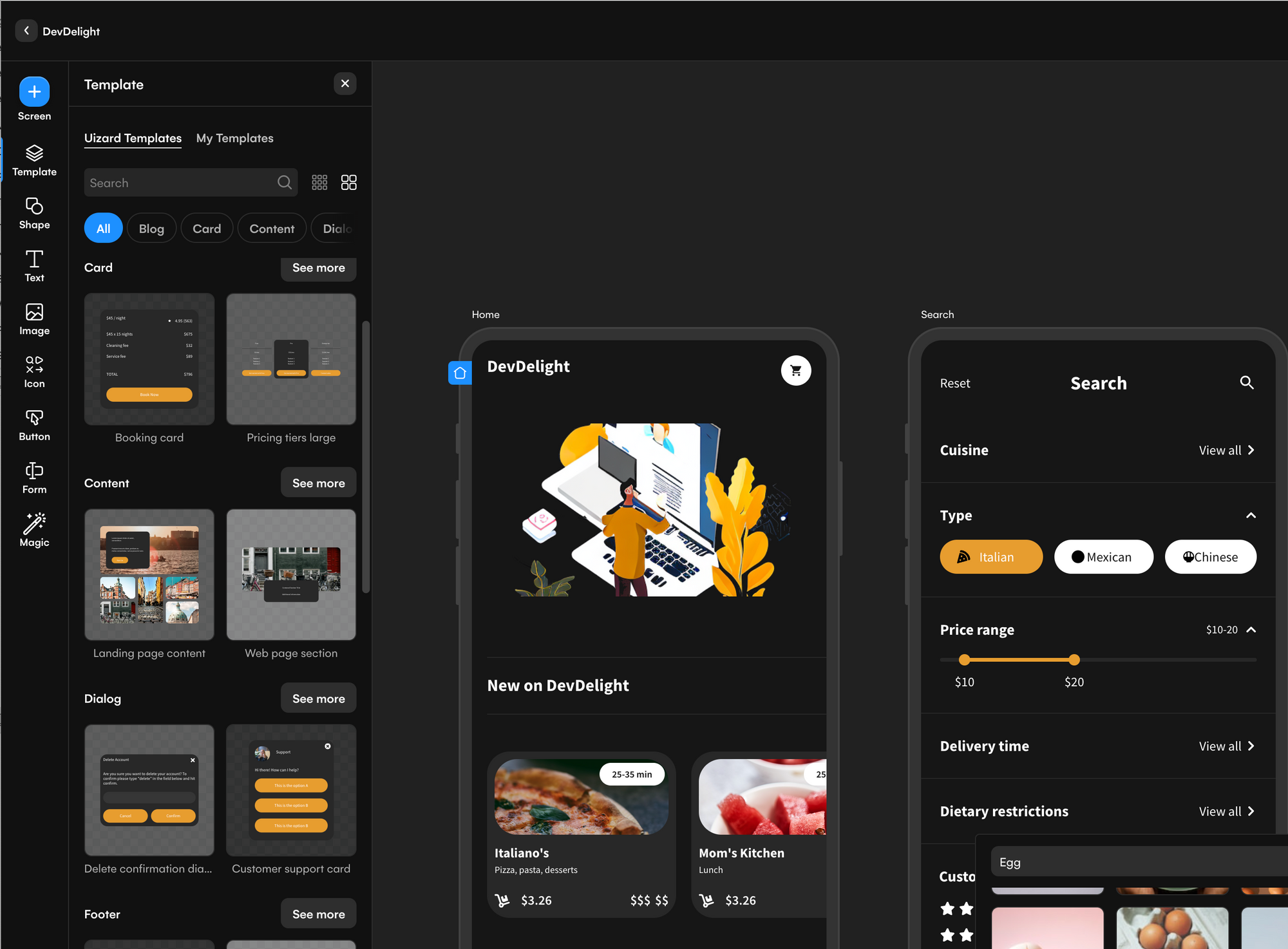
Along with these complete screens, the AI also generated a selection of components/templates in a matching style. So I was able to add these and expand on the existing screens and create other screens to complement the designs and complete my flows.
Generating Screens from a Screenshot or Image
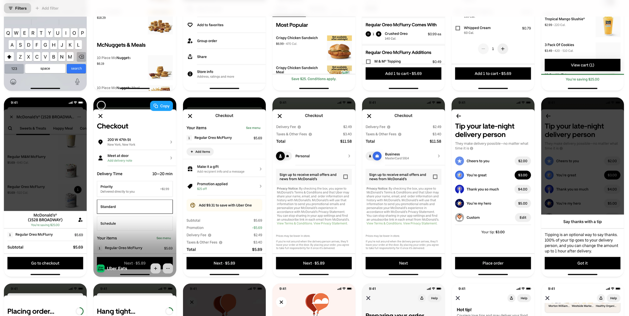
Another absolutely amazing feature is the image-to-UI screen conversion. For this example, I went over to Mobbin (you could also use other sites like find real UX/UI design patterns) and I searched for Uber Eats and grabbed a screenshot of their checkout screen.
Back in Uizard, I clicked on the Magic tool, then Scan Screenshot
I dragged in the checkout screen that I just saved and clicked import
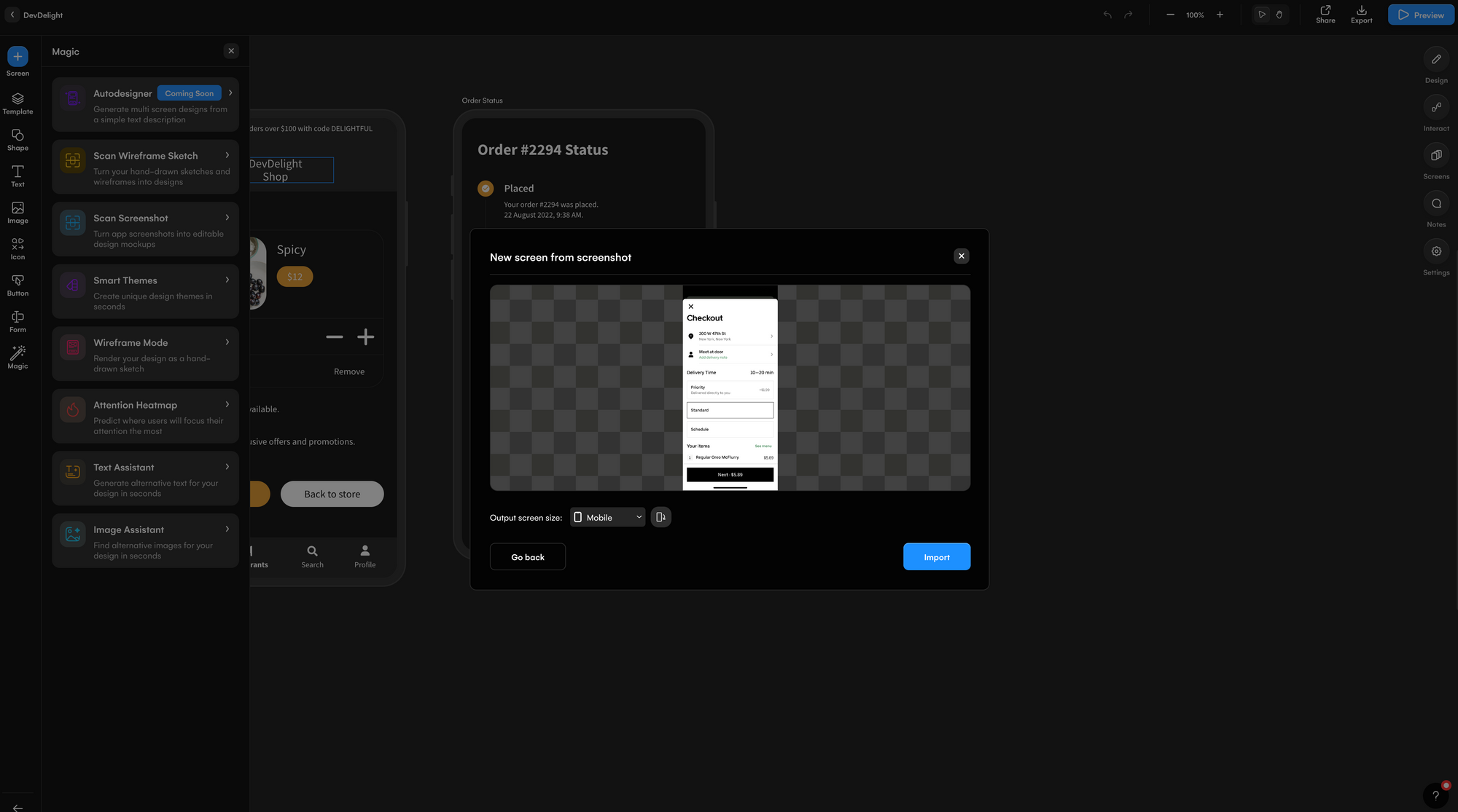
Uizard added the screenshot to my existing flow and made every single element fully editable!
However, I would need to tweak the colors and font if I wanted it to match the previously generated dark design, but of course, Uizard thought of that too. There are a few ways we can make this match
Change the Design with Smart Themes
One of the most exciting aspects of using AutoDesigner is the option to change the theme and style of your design based on an image. You can upload an image of an app design or any other visual inspiration, and the AI will apply the colors and styles from that image to the generated design. This allows for endless possibilities in terms of global customization and personalization.
So in order to make it match the existing theme, I took a screenshot of one of the other screens and created a theme by uploading it to the Smart Themes tool.
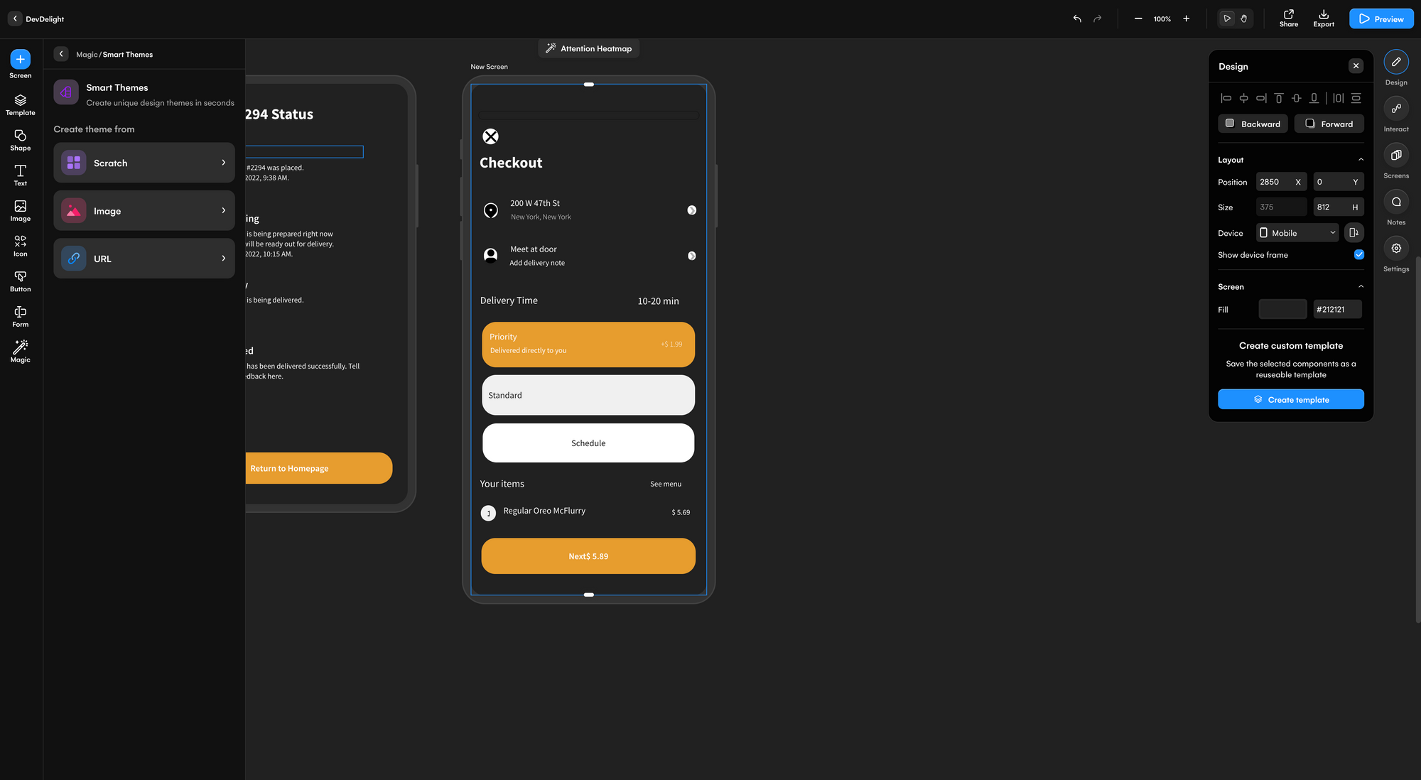
And like magic, the Uber Eats screen now matches the rest of my screens and is fully editable!
Automatic Prototypes
Another awesome right out-of-the-box feature is that when Autodesigner generates these screens, it also generates the flows for them and connects them together allowing you to preview and interact with the design as a prototype. So, you can click Preview right after Autodesigner does its thing and start clicking around and using it. It even generated the hotspots for you so that you know exactly what to click on.
I did find the prototype to be a bit buggy as Autodesigner placed connection points in unusual places, but I imagine this will be well worked out by the time the Beta release goes live.
AI-Assisted Content Generation
Another extremely helpful feature is the AI Text and Image Assistant. Clicking on any editable text or image element brings up a little button with a cycle icon that lets you instruct AI to regenerate that piece of content. I was able to select a title, browse through the suggestions and regenerate new copy and content. Clicking on an image also brought up similar suggestions based on that image.
Wireframe Mode
Another very unique feature is Wireframe mode. Let’s say I wanted to edit these screens in low fidelity or I wanted to gray box some screens in order to add these UI designs? I can simply click on Magic and then Click Wireframe Mode to edit or add things in low-fidelity.
Manually Change the Entire Theme and Styles
Another way to change the colors and style is by using the manual method. To find this option click on Magic > Smart Themes > From Scratch and you’ll find some preset options and a manual color picker that allows you to change up the style of your theme. I experimented with a more traditional look, featuring square corner buttons, light design, and a blue color scheme and it generated this:
I also wanted to try just changing the color scheme of the overall design and that was as simple as using going to Magic > Smart Theme > From Scratch and using the color picker to select a new Primary color.
Hand-Sketch to UI design
One of my personal favorite features is actually something that has been around inside of Uizard’s interface for a while now, you can actually hand sketch a wireframe on a piece of paper, take a picture of it and upload it and Uizard will process your drawing and turn into into a high-fidelity screen design right before your eyes. I can’t believe how well it does this and how easily you can then integrate that into the rest of your flow.
Regenerating results
Another thing that I found immensely helpful was that I was able to regenerate the designs just by clicking on the Regenerate option from the prompt in the lower left-hand corner. From my experience, this actually resulted in it better designs the second time around.
Design System Reference
One very interesting thing about the Autodesigner prompt is that you can reference a popular existing design system and the AI will generate the designs in that style. I tried this out by asking it to ‘Generate a website for podcasters to show their latest episodes using the Material Design System‘
It generated these designs delightfully named PodCastle.
Pretty impressive. I feel like it kind of read my mind on this and it also generated a few more really useful screens that include some user experience considerations I didn’t expect, such as showing how much storage is left in the podcaster’s account in the sidebar.
Things to note:
After a few days of trial and error and trying to both break the system and get the best our of it, I noticed a few things that are useful to know about.
1. Be As Descriptive As Possible
Just like with ChatGPT, you want to feed the generator with enough information, details and context to produce a quality result. Although you can start with a very simple, plain English prompt and still receive more than acceptable results, consider including details based on your primary or secondary user research such as information about your target audience, your brand color palette, the style, the font (sans-serif typefaces or serif typefaces). The more detail, the better.
2. Generate Designs in Other Languages
Speaking of plain English, English is not the only language you can generate designs in. I tried creating a Meditation App in Spanish and all of the example text was indeed in Spanish!
3. Better The Second Time
Keep in mind that it might not work perfectly the first time, as I mentioned, I notice it gets better every time, so don’t be afraid to regenerate the screens if you’re not satisfied with the results.
4. Autodesigner Waitlist and Pro Plan Discount
At the time of this experiment there is a waiting list, so make sure you are signed up here to gain access. Once you’ve gotten your invitation, you’ll also need a Pro Plan, luckily DesignerUp is partnered with Uizard, so if you’re a student of our course, you get a huge discount to Uizard’s Pro Plan as part of your student perks.
Overall impressions
What surprised me the most was how incredibly fast the screen generation was, it never took more than a minute for the prompt to output the final screens and it did so with a decent degree of accuracy and taste.
At present, there are a few kinks in terms of the text not fitting perfectly into the text field areas, and sometimes the hand-sketch to design processing doesn’t accurately render my poorly drawn design, but that’s easily remedied by adjusting things manually and something that I’m sure will be addressed before it hits public Beta.
Does this make me concerned our my profession? The value proposition for Uizard at this time isn’t focused on professional UI designers but more so on democratizing design and giving non-designers and those in the ideation phase a way to create an approximation of a final, high-fidelity prototype quickly. This interview with founder Tony Beltramelli is great to listen to get a behind-the-scenes take on the goal of Uizard’s Autodesigner and how it’s positioned the tech world. Still the rapid rate at which this type of AI tech is emerging does give me pause.
On one hand, I do see a lot of room for improvement here. It’s still going to take a great design eye and understanding of color theory, visual hierarchy and typography and of course, solid user research and analysis with an expertise in UX and UI to get these to look extra professional, to be effectively implemented by developers and viable in real markets. On the other hand, it may just be a matter of time before AI goes beyond generative, LLM models and starts doing all parts of product design.
But for now, it’s just incredible that you can start from so much instead of starting from nothing. I think that is precisely the value of AI at this current stage of its abilities, to help you, to inspire you, to assist you, and hopefully, to make our jobs a bit easier.